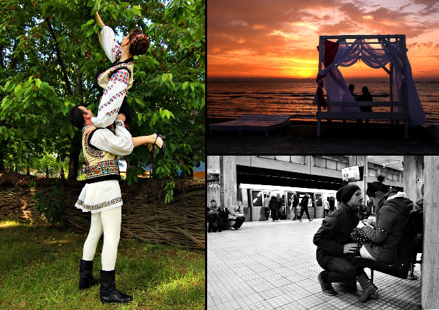
For a photographer, the ability to pick his “right” photos is a very important one, be it when satisfying a customer need, presenting a portfolio, entering a contest and such. Having good photos but making poor picks or having not so good photos but clever picks, this can make a difference.
We often face face this dilemma: which photos to pick? I want to share the inner of my mind on how my personal selection worked when submitting photos for the Dragobete photo contest and exhibition. Any such process is open for improvement, so it worth thinkering.
The rule was simple: submit up to 3 pictures fitting the theme, “Dragobete kisses the girls”, so kisses, nice gestures, love, relationships and such. I have quite a few of those, so in a first step I made a rough selection of over 20 photos vaguely fitting made in the past year (that’s not a contest rule, is may own, submit fresh stuff). Then in a second step I narrowed the selection to 5, which I felt are better. Just for fun, I added one more to this selection, to have 6, two full sets in the case I decide I have split personality and participate twice. Of course I am not split, so had to proceed to final 3 images selection.
I went with images very different in style, theme and technique. One of them is a sunrise, quite cheesy, but such images have usually a big impact with the general audience got decent scores on various photography websites. Another one was street photography in black and white, I knew a majority of the jury are street photographers, they may appreciate that or, by contrary, be more careful when judging it. And the other one was a “rural” one, selected knowing the exhibition take place at the Village Museum and Dragobete is a traditional holiday.

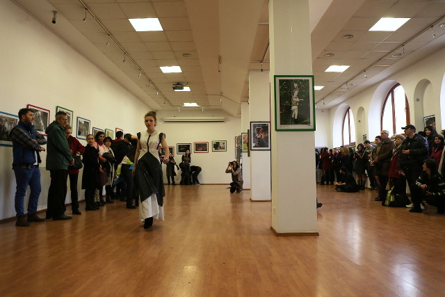
Net result: the “rural” photo in the exhibition. Was my strategy successful? Well, I didn’t expect any prize, is highly unlikely one would win something two years in a row. Also, is highly unlikely one would have more than one picture accepted, considering the large number of participants (no one had this year). So, in a word: average.
On a positive note, I could note the placement. Whoever put the pictures on the walls, it happened for my photo to be front and center, at the entrance. Very hard not to be spotted, no matter what happens around. Also, the museum used it in a poster to advertise the exhibition on Facebook. Again, not a hard guess, since the photo was made inside the same museum.

For me, I was somewhat puzzled, I expected the sunrise to have a better score, it scored better in all the places I submitted it, and somewhat disappointed, since it required some advanced editing for which I could write an editing tutorial.
The real disappointment is I have for quite time a few good (I think) photographic ideas in my head for this theme but didn’t got yet to shoot them. Maybe next year. Or the year after. Or who knows…
 This work is licensed under a Creative Commons Attribution-Share Alike 3.0 License.
